
Why Formatting Matters As Much as Grammar
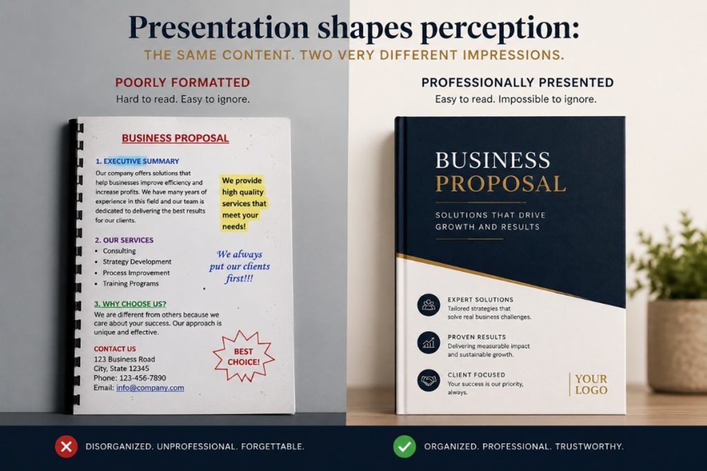
Formatting is your business’s book cover, and it is the first impression your client will form of your business.
People judge a book by its cover in a fraction of a second, using visual cues to determine genre, quality, and tone. Key elements such as color, typography, imagery, and author recognition help readers decide if a book aligns with their interests, often acting as a “hook” in a crowded marketplace.
So do your client’s judge your presentation, document, email etc by visual styles, visual impact, and typography. Therefore, it is of vital importance to your business that you understand the key aspects of formatting which determine how content appears i.e. how it is organised, styled, and structured.
The definition of “formatting” is the process of arranging, structuring, and styling content (like text, images, or data) to improve its appearance, readability, and organization. It includes adjusting fonts, margins, headings, and spacing.
Choosing Fonts with Intention
With thousands of fonts available, it’s tempting to experiment but first ask: “What impression do I want to create?”
- Tradition, authority, and reliability: Times New Roman, Baskerville
- Modern, clean, and straightforward: Helvetica, Arial
- Elegance, creativity, and warmth: Lucida Handwriting
- Friendliness and approachability: Comfortaa, Varela Round
- Strength, urgency, and impact: Impact, Anton
Playful or whimsical fonts can also evoke moods such as joy, nostalgia, or casualness (e.g., Comic Sans, Papyrus). Use them sparingly for when the tone does not match the message, the result can feel unprofessional and may reduce trust.
Once you’ve chosen a font family, apply it consistently across headings, subheadings, and body text, using size, bold, italics, underline, and colour to create a clear hierarchy.
| Size | Bolding | Italics | Underline | Colors | |
| HEADING 1 | 13 | HEADING | HEADING | HEADING | HEADING |
| SUB | 12 | Sub | Sub | Sub | Sub |
| TEXT | 11 | Text | Text | Text |
While formatting can enhance a document, over-formatting can have the opposite effect. Too many fonts, excessive colours, inconsistent sizing, or unnecessary bolding and underlining can distract the reader and weaken the professionalism of the content. Simplicity and consistency are often more powerful than excessive design.
Good structure helps readers absorb information quickly and comfortably. Aim for a clean layout that guides the eye and makes key points easy to find.
Practical ways to improve readability
- Use clear headings and subheadings to break content into sections and help readers scan for what matters.
- Build in white space (through spacing and line breaks) so the page does not feel cluttered or overwhelming.
- Choose the right list style: use bullet points for items with no set order, and numbered lists for steps, priority, or sequence.
- Set appropriate margins to frame the content, improve readability, and leave room for binding or notes.
- Use indents to separate paragraphs or draw attention to key information (for example, quotes or examples).
- Apply alignment consistently (left, centred, or justified) to support readability and give the page a polished, organised look.
Good formatting does more than make a document look attractive; it guides the reader effortlessly through the content, whereas a poorly formatted document can make even excellent content difficult to read.
Formatting is not merely decoration; it is a communication tool. It influences how your audience feels about your business before they read a single sentence. Professional formatting demonstrates attention to detail, reinforces your brand identity, and improves the reader’s overall experience and builds confidence, credibility, and trust in your business. In many cases, the presentation of your document determines whether the reader continues reading at all.